Aug 7, 2025
Consistency in Modern Branding
Why a unified brand presence builds trust, how flexibility keeps it fresh, and where to draw the line between repetition and reinvention.
Branding
Strategy
Design
The Power of Consistency
A consistent brand presence builds recognition, trust, and credibility — but it’s more than just using the same logo everywhere.
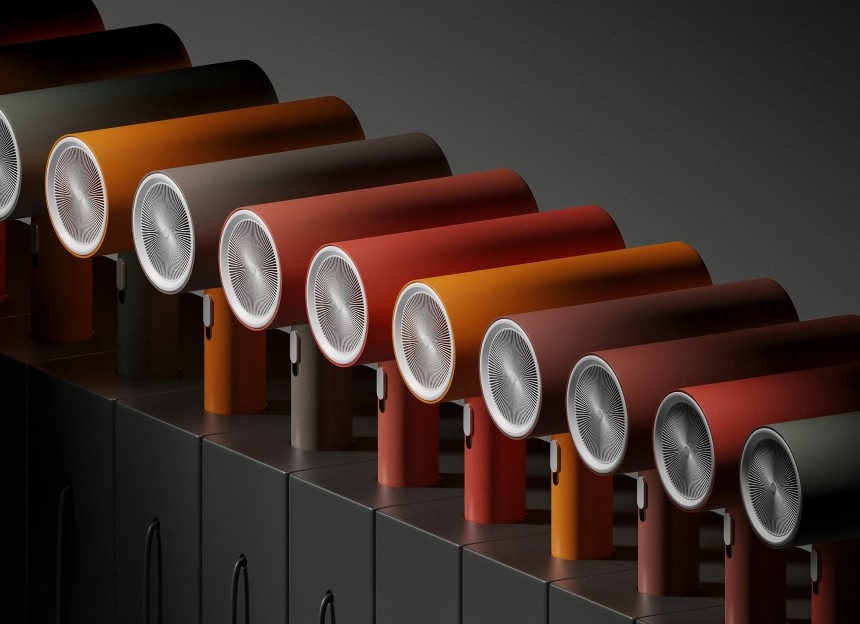
In modern branding, consistency is about creating a visual and tonal language that audiences can instantly recognise across any touchpoint. It includes the obvious — logos, colours, typography — but also the subtler aspects: photographic style, illustration choices, tone of voice, and even the pacing of animations. When these elements align, the brand becomes a familiar presence in people’s lives, and familiarity drives trust.
Global leaders like IKEA and Starbucks demonstrate how far this can go. IKEA’s bold blue and yellow, paired with clean typography and flat product photography, works seamlessly in catalogues, billboards, and digital ads alike. Starbucks maintains its green palette and circular mark, but also extends consistency into store layouts, menu design, and seasonal campaigns — ensuring that whether you’re in Seattle or Seoul, the experience feels unmistakably Starbucks.
Consistency also simplifies decision-making for creative teams. With a clear visual and messaging framework, designers and marketers spend less time debating style choices and more time crafting ideas that fit the brand. This efficiency not only saves time but also ensures every output reinforces the same brand promise.

Adapting Without Losing Yourself
Adapting Without Losing Yourself
Consistency doesn’t mean rigidity — the strongest brands know when to flex their identity to stay relevant.
Rigidly applying guidelines can make a brand predictable, or worse, irrelevant in a fast-changing cultural landscape. The goal is to maintain recognisability while allowing room for creative and contextual adaptation. This balance is what keeps a brand alive.
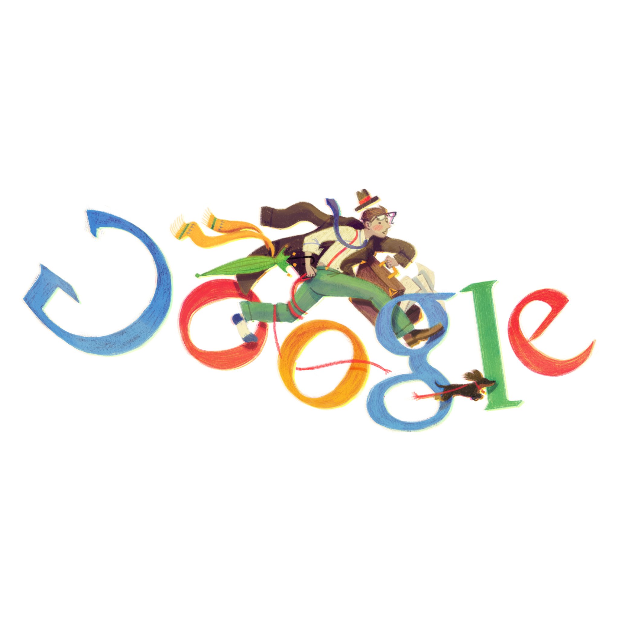
Take Google’s Doodles — the core wordmark remains, but the surrounding illustration changes to reflect global events, cultural moments, and regional celebrations. Similarly, McDonald’s keeps its golden arches intact but experiments with scale, context, and messaging to suit different markets, from playful typography-led ads in Japan to minimalist outdoor campaigns in Europe.
Flexibility is especially critical when a brand spans multiple cultures and platforms. What works in a print ad in New York may need visual and tonal adjustments to connect with audiences in Mumbai or São Paulo. By understanding which elements are core and which can flex — such as secondary colours, photography style, or layout rhythm — brands remain both consistent and relevant, no matter the market.
Structure That Supports Growth
Structure That Supports Growth
Consistency works best when supported by a clear, adaptable system that can grow with the brand.
A well-structured identity system acts as both a safety net and a creative springboard. It ensures that every new execution — whether a TikTok ad, a product launch microsite, or a physical pop-up store — feels like part of the same story. This structure might include grid systems for layouts, defined typographic hierarchies, and rules for applying colour and imagery.
Apple’s global brand is a masterclass in this. From packaging to keynote presentations, the grid, type scale, and white space are always familiar, even when the content or product changes radically. The structure gives freedom to experiment — for example, through bold photography in iPhone campaigns — without ever confusing the audience about who’s speaking.
The strongest brands treat their guidelines as living documents. They evolve as the brand grows, adding new applications, adjusting visual assets, and documenting successful deviations. This approach keeps the identity flexible, relevant, and future-proof, ensuring that consistency becomes a tool for growth rather than a constraint.


FAQ
FAQ
01
How does the process work?
02
How much does it cost?
03
How will we communicate?
04
Will I receive all the files and rights?
05
Can the project be completed urgently?
06
Do you work internationally?
07
What if I’m not satisfied with the result?
08
Do you provide support after the project is finished?
Aug 7, 2025
Consistency in Modern Branding
Why a unified brand presence builds trust, how flexibility keeps it fresh, and where to draw the line between repetition and reinvention.
Branding
Strategy
Design
The Power of Consistency
A consistent brand presence builds recognition, trust, and credibility — but it’s more than just using the same logo everywhere.
In modern branding, consistency is about creating a visual and tonal language that audiences can instantly recognise across any touchpoint. It includes the obvious — logos, colours, typography — but also the subtler aspects: photographic style, illustration choices, tone of voice, and even the pacing of animations. When these elements align, the brand becomes a familiar presence in people’s lives, and familiarity drives trust.
Global leaders like IKEA and Starbucks demonstrate how far this can go. IKEA’s bold blue and yellow, paired with clean typography and flat product photography, works seamlessly in catalogues, billboards, and digital ads alike. Starbucks maintains its green palette and circular mark, but also extends consistency into store layouts, menu design, and seasonal campaigns — ensuring that whether you’re in Seattle or Seoul, the experience feels unmistakably Starbucks.
Consistency also simplifies decision-making for creative teams. With a clear visual and messaging framework, designers and marketers spend less time debating style choices and more time crafting ideas that fit the brand. This efficiency not only saves time but also ensures every output reinforces the same brand promise.
Adapting Without Losing Yourself
Consistency doesn’t mean rigidity — the strongest brands know when to flex their identity to stay relevant.
Rigidly applying guidelines can make a brand predictable, or worse, irrelevant in a fast-changing cultural landscape. The goal is to maintain recognisability while allowing room for creative and contextual adaptation. This balance is what keeps a brand alive.
Take Google’s Doodles — the core wordmark remains, but the surrounding illustration changes to reflect global events, cultural moments, and regional celebrations. Similarly, McDonald’s keeps its golden arches intact but experiments with scale, context, and messaging to suit different markets, from playful typography-led ads in Japan to minimalist outdoor campaigns in Europe.
Flexibility is especially critical when a brand spans multiple cultures and platforms. What works in a print ad in New York may need visual and tonal adjustments to connect with audiences in Mumbai or São Paulo. By understanding which elements are core and which can flex — such as secondary colours, photography style, or layout rhythm — brands remain both consistent and relevant, no matter the market.
Structure That Supports Growth
Consistency works best when supported by a clear, adaptable system that can grow with the brand.
A well-structured identity system acts as both a safety net and a creative springboard. It ensures that every new execution — whether a TikTok ad, a product launch microsite, or a physical pop-up store — feels like part of the same story. This structure might include grid systems for layouts, defined typographic hierarchies, and rules for applying colour and imagery.
Apple’s global brand is a masterclass in this. From packaging to keynote presentations, the grid, type scale, and white space are always familiar, even when the content or product changes radically. The structure gives freedom to experiment — for example, through bold photography in iPhone campaigns — without ever confusing the audience about who’s speaking.
The strongest brands treat their guidelines as living documents. They evolve as the brand grows, adding new applications, adjusting visual assets, and documenting successful deviations. This approach keeps the identity flexible, relevant, and future-proof, ensuring that consistency becomes a tool for growth rather than a constraint.
FAQ
01
How does the process work?
02
How much does it cost?
03
How will we communicate?
04
Will I receive all the files and rights?
05
Can the project be completed urgently?
06
Do you work internationally?
07
What if I’m not satisfied with the result?
08
Do you provide support after the project is finished?
Aug 7, 2025
Consistency in Modern Branding
Why a unified brand presence builds trust, how flexibility keeps it fresh, and where to draw the line between repetition and reinvention.
Branding
Strategy
Design
The Power of Consistency
A consistent brand presence builds recognition, trust, and credibility — but it’s more than just using the same logo everywhere.
In modern branding, consistency is about creating a visual and tonal language that audiences can instantly recognise across any touchpoint. It includes the obvious — logos, colours, typography — but also the subtler aspects: photographic style, illustration choices, tone of voice, and even the pacing of animations. When these elements align, the brand becomes a familiar presence in people’s lives, and familiarity drives trust.
Global leaders like IKEA and Starbucks demonstrate how far this can go. IKEA’s bold blue and yellow, paired with clean typography and flat product photography, works seamlessly in catalogues, billboards, and digital ads alike. Starbucks maintains its green palette and circular mark, but also extends consistency into store layouts, menu design, and seasonal campaigns — ensuring that whether you’re in Seattle or Seoul, the experience feels unmistakably Starbucks.
Consistency also simplifies decision-making for creative teams. With a clear visual and messaging framework, designers and marketers spend less time debating style choices and more time crafting ideas that fit the brand. This efficiency not only saves time but also ensures every output reinforces the same brand promise.
Adapting Without Losing Yourself
Consistency doesn’t mean rigidity — the strongest brands know when to flex their identity to stay relevant.
Rigidly applying guidelines can make a brand predictable, or worse, irrelevant in a fast-changing cultural landscape. The goal is to maintain recognisability while allowing room for creative and contextual adaptation. This balance is what keeps a brand alive.
Take Google’s Doodles — the core wordmark remains, but the surrounding illustration changes to reflect global events, cultural moments, and regional celebrations. Similarly, McDonald’s keeps its golden arches intact but experiments with scale, context, and messaging to suit different markets, from playful typography-led ads in Japan to minimalist outdoor campaigns in Europe.
Flexibility is especially critical when a brand spans multiple cultures and platforms. What works in a print ad in New York may need visual and tonal adjustments to connect with audiences in Mumbai or São Paulo. By understanding which elements are core and which can flex — such as secondary colours, photography style, or layout rhythm — brands remain both consistent and relevant, no matter the market.
Structure That Supports Growth
Consistency works best when supported by a clear, adaptable system that can grow with the brand.
A well-structured identity system acts as both a safety net and a creative springboard. It ensures that every new execution — whether a TikTok ad, a product launch microsite, or a physical pop-up store — feels like part of the same story. This structure might include grid systems for layouts, defined typographic hierarchies, and rules for applying colour and imagery.
Apple’s global brand is a masterclass in this. From packaging to keynote presentations, the grid, type scale, and white space are always familiar, even when the content or product changes radically. The structure gives freedom to experiment — for example, through bold photography in iPhone campaigns — without ever confusing the audience about who’s speaking.
The strongest brands treat their guidelines as living documents. They evolve as the brand grows, adding new applications, adjusting visual assets, and documenting successful deviations. This approach keeps the identity flexible, relevant, and future-proof, ensuring that consistency becomes a tool for growth rather than a constraint.
FAQ
How does the process work?
How much does it cost?
How will we communicate?
Will I receive all the files and rights?
Can the project be completed urgently?
Do you work internationally?
What if I’m not satisfied with the result?
Do you provide support after the project is finished?