Aug 8, 2025
Design Rules: Bend or Break?
Exploring how design frameworks streamline creativity, when breaking the mould sparks innovation, and why context is everything in visual communication.
Design
Creativity
Insights
Design Innovation
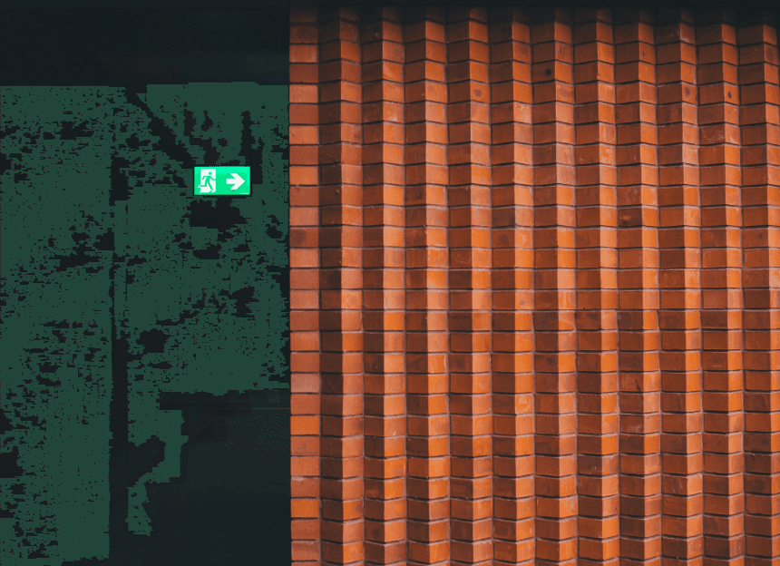
Templates can set the stage for great design — but knowing when to step away from them makes all the difference.
Templates simplify workflows, set direction, and save time — especially under tight deadlines or in teams with varied skill levels. They provide structure that allows designers to focus on solving the core problem. But strict reliance on a template risks making everything look alike: the same layouts, styles, and formats, leading to designs that blur together and lose distinctiveness. Audiences notice the sameness — and scroll past.
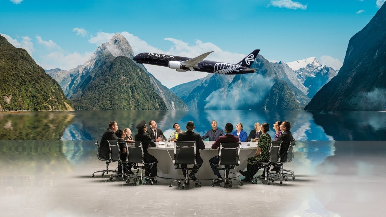
Rules are worth breaking when there’s a clear reason. An unexpected element in a standard interface can draw attention; an airline safety video with humour can break passengers out of autopilot. Air New Zealand’s creative safety videos show how reimagining a familiar format can make it engaging without losing clarity. The key is avoiding chaos — experiments should guide the user toward the goal, not away from it. For example, Coca-Cola’s “Happiness Machine” placed an interactive vending machine in a busy area, offering surprises and small gifts. It was playful and unexpected, but also perfectly aligned with the brand’s promise of joy.
Context-Driven Design
Context-Driven Design
When design matches the audience, moment, and medium, it becomes far more than decoration — it becomes relevant.
There is no universal solution. An accounting app demands simplicity, while a street festival poster benefits from boldness. What works at a trade show might fail in a mobile app; a print that looks great on a hoodie may be wrong for food packaging. Context is a mix of audience, goal, location, time, and emotional state. Are they tired? In a hurry? Reading on the move? These factors shape perception as much as the platform itself.
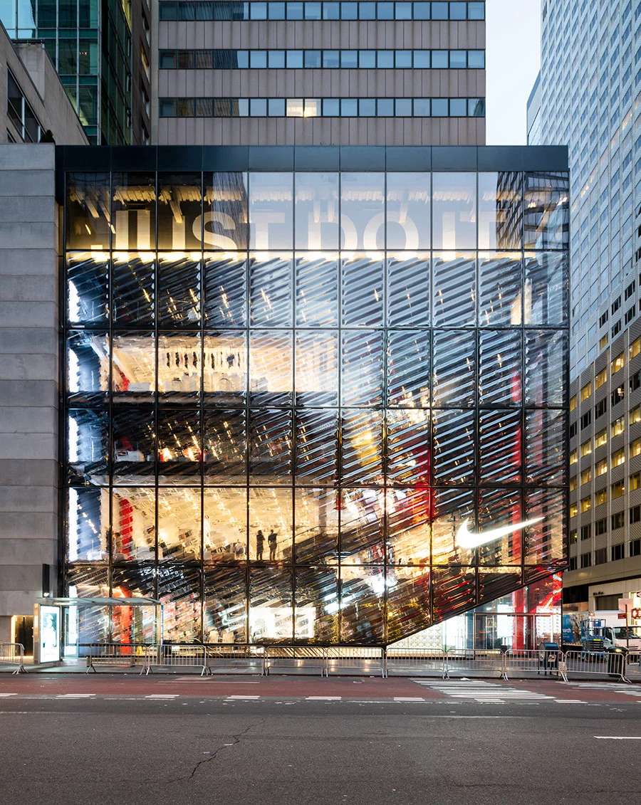
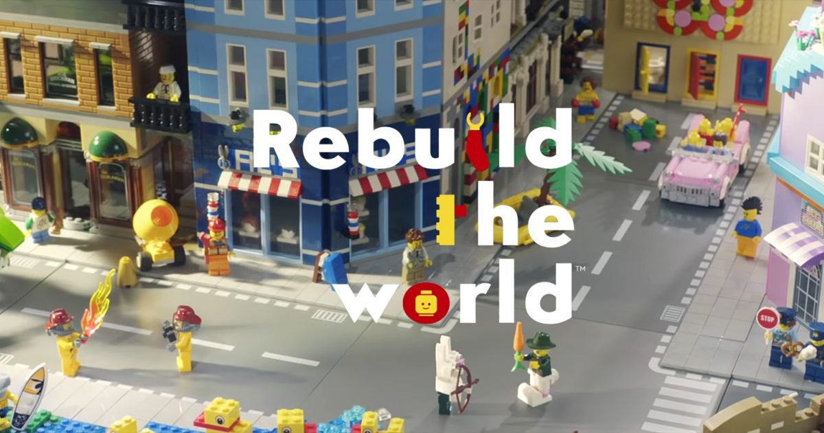
Consider Nike’s House of Innovation stores in New York, Paris, and Shanghai. The exterior grabs the attention of busy pedestrians with large, high-impact visuals, while the interiors are designed for slower, immersive engagement. Another example: LEGO’s Rebuild the World campaign adapted its creative to each medium — from billboards to interactive installations — while keeping the central theme intact.
Design for scenarios: one version for a glance, another for in-depth reading. Understand what your audience already knows about the brand and how the design has evolved before making big changes — otherwise, you risk losing trust.
Structure as a Creative Launchpad
Structure as a Creative Launchpad
The best designs don’t reject structure — they use it as a springboard for originality.
Even the boldest projects rest on a foundation: grid, composition, typography, and colour. Strong ideas often come from slight shifts, not total reinvention — keeping a familiar layout while playing with type, or maintaining a common flow but adding an unexpected detail. It’s important to measure how far you can push before clarity is lost. Test with real people: do they see it, understand it, react to it? Mark non-negotiables (like readability) early, and decide where you can experiment (pattern, angle, colour).
Templates work because they deliver:
Structure – Elements are where users expect them, making navigation intuitive.
Hierarchy – Headlines stand out, important content is prioritised, and scanning feels natural.
Grid – Invisible but essential for order.
Contrast – Size, colour, spacing, and weight prevent visual monotony.
Consistency – Understanding one screen makes the rest predictable.
Flexibility for text – Accommodates varying lengths for headlines and labels, avoiding layout breakage.
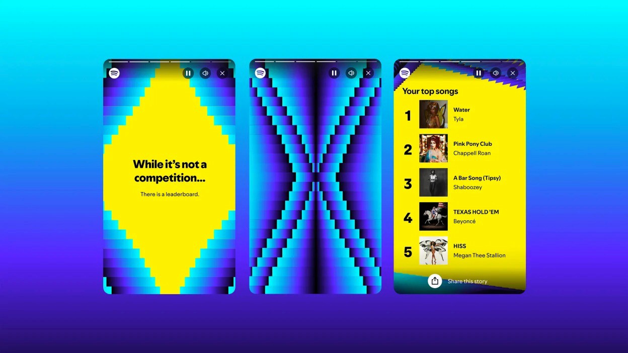
Spotify Wrapped is a perfect example: the structure is consistent year to year, but each edition adds a bold new visual twist, keeping it fresh and shareable.
Even experiments benefit from discipline. As in music, you can only break rhythm effectively once you’ve mastered it.

FAQ
FAQ
01
How does the process work?
02
How much does it cost?
03
How will we communicate?
04
Will I receive all the files and rights?
05
Can the project be completed urgently?
06
Do you work internationally?
07
What if I’m not satisfied with the result?
08
Do you provide support after the project is finished?
Aug 8, 2025
Design Rules: Bend or Break?
Exploring how design frameworks streamline creativity, when breaking the mould sparks innovation, and why context is everything in visual communication.
Design
Creativity
Insights
Design Innovation
Templates can set the stage for great design — but knowing when to step away from them makes all the difference.
Templates simplify workflows, set direction, and save time — especially under tight deadlines or in teams with varied skill levels. They provide structure that allows designers to focus on solving the core problem. But strict reliance on a template risks making everything look alike: the same layouts, styles, and formats, leading to designs that blur together and lose distinctiveness. Audiences notice the sameness — and scroll past.
Rules are worth breaking when there’s a clear reason. An unexpected element in a standard interface can draw attention; an airline safety video with humour can break passengers out of autopilot. Air New Zealand’s creative safety videos show how reimagining a familiar format can make it engaging without losing clarity. The key is avoiding chaos — experiments should guide the user toward the goal, not away from it. For example, Coca-Cola’s “Happiness Machine” placed an interactive vending machine in a busy area, offering surprises and small gifts. It was playful and unexpected, but also perfectly aligned with the brand’s promise of joy.
Context-Driven Design
When design matches the audience, moment, and medium, it becomes far more than decoration — it becomes relevant.
There is no universal solution. An accounting app demands simplicity, while a street festival poster benefits from boldness. What works at a trade show might fail in a mobile app; a print that looks great on a hoodie may be wrong for food packaging. Context is a mix of audience, goal, location, time, and emotional state. Are they tired? In a hurry? Reading on the move? These factors shape perception as much as the platform itself.
Consider Nike’s House of Innovation stores in New York, Paris, and Shanghai. The exterior grabs the attention of busy pedestrians with large, high-impact visuals, while the interiors are designed for slower, immersive engagement. Another example: LEGO’s Rebuild the World campaign adapted its creative to each medium — from billboards to interactive installations — while keeping the central theme intact.
Design for scenarios: one version for a glance, another for in-depth reading. Understand what your audience already knows about the brand and how the design has evolved before making big changes — otherwise, you risk losing trust.
Structure as a Creative Launchpad
The best designs don’t reject structure — they use it as a springboard for originality.
Even the boldest projects rest on a foundation: grid, composition, typography, and colour. Strong ideas often come from slight shifts, not total reinvention — keeping a familiar layout while playing with type, or maintaining a common flow but adding an unexpected detail. It’s important to measure how far you can push before clarity is lost. Test with real people: do they see it, understand it, react to it? Mark non-negotiables (like readability) early, and decide where you can experiment (pattern, angle, colour).
Templates work because they deliver:
Structure – Elements are where users expect them, making navigation intuitive.
Hierarchy – Headlines stand out, important content is prioritised, and scanning feels natural.
Grid – Invisible but essential for order.
Contrast – Size, colour, spacing, and weight prevent visual monotony.
Consistency – Understanding one screen makes the rest predictable.
Flexibility for text – Accommodates varying lengths for headlines and labels, avoiding layout breakage.
Spotify Wrapped is a perfect example: the structure is consistent year to year, but each edition adds a bold new visual twist, keeping it fresh and shareable.
Even experiments benefit from discipline. As in music, you can only break rhythm effectively once you’ve mastered it.
FAQ
01
How does the process work?
02
How much does it cost?
03
How will we communicate?
04
Will I receive all the files and rights?
05
Can the project be completed urgently?
06
Do you work internationally?
07
What if I’m not satisfied with the result?
08
Do you provide support after the project is finished?
Aug 8, 2025
Design Rules: Bend or Break?
Exploring how design frameworks streamline creativity, when breaking the mould sparks innovation, and why context is everything in visual communication.
Design
Creativity
Insights
Design Innovation
Templates can set the stage for great design — but knowing when to step away from them makes all the difference.
Templates simplify workflows, set direction, and save time — especially under tight deadlines or in teams with varied skill levels. They provide structure that allows designers to focus on solving the core problem. But strict reliance on a template risks making everything look alike: the same layouts, styles, and formats, leading to designs that blur together and lose distinctiveness. Audiences notice the sameness — and scroll past.
Rules are worth breaking when there’s a clear reason. An unexpected element in a standard interface can draw attention; an airline safety video with humour can break passengers out of autopilot. Air New Zealand’s creative safety videos show how reimagining a familiar format can make it engaging without losing clarity. The key is avoiding chaos — experiments should guide the user toward the goal, not away from it. For example, Coca-Cola’s “Happiness Machine” placed an interactive vending machine in a busy area, offering surprises and small gifts. It was playful and unexpected, but also perfectly aligned with the brand’s promise of joy.
Context-Driven Design
When design matches the audience, moment, and medium, it becomes far more than decoration — it becomes relevant.
There is no universal solution. An accounting app demands simplicity, while a street festival poster benefits from boldness. What works at a trade show might fail in a mobile app; a print that looks great on a hoodie may be wrong for food packaging. Context is a mix of audience, goal, location, time, and emotional state. Are they tired? In a hurry? Reading on the move? These factors shape perception as much as the platform itself.
Consider Nike’s House of Innovation stores in New York, Paris, and Shanghai. The exterior grabs the attention of busy pedestrians with large, high-impact visuals, while the interiors are designed for slower, immersive engagement. Another example: LEGO’s Rebuild the World campaign adapted its creative to each medium — from billboards to interactive installations — while keeping the central theme intact.
Design for scenarios: one version for a glance, another for in-depth reading. Understand what your audience already knows about the brand and how the design has evolved before making big changes — otherwise, you risk losing trust.
Structure as a Creative Launchpad
The best designs don’t reject structure — they use it as a springboard for originality.
Even the boldest projects rest on a foundation: grid, composition, typography, and colour. Strong ideas often come from slight shifts, not total reinvention — keeping a familiar layout while playing with type, or maintaining a common flow but adding an unexpected detail. It’s important to measure how far you can push before clarity is lost. Test with real people: do they see it, understand it, react to it? Mark non-negotiables (like readability) early, and decide where you can experiment (pattern, angle, colour).
Templates work because they deliver:
Structure – Elements are where users expect them, making navigation intuitive.
Hierarchy – Headlines stand out, important content is prioritised, and scanning feels natural.
Grid – Invisible but essential for order.
Contrast – Size, colour, spacing, and weight prevent visual monotony.
Consistency – Understanding one screen makes the rest predictable.
Flexibility for text – Accommodates varying lengths for headlines and labels, avoiding layout breakage.
Spotify Wrapped is a perfect example: the structure is consistent year to year, but each edition adds a bold new visual twist, keeping it fresh and shareable.
Even experiments benefit from discipline. As in music, you can only break rhythm effectively once you’ve mastered it.
FAQ
How does the process work?
How much does it cost?
How will we communicate?
Will I receive all the files and rights?
Can the project be completed urgently?
Do you work internationally?
What if I’m not satisfied with the result?
Do you provide support after the project is finished?