
Aug 7, 2025
Visual Identity That Works
Polestar EV explores the future of electric mobility, blending cutting-edge design with innovation. Dive into the performance insights shaping the next area.
Branding
Graphic Design
Visual Identity
Brand Foundations in Action
Strong visual identity is built on clear principles — but the magic happens when you know how and when to adapt them.
A cohesive brand identity begins with consistency. Unified colour palettes, typographic hierarchies, and layout systems make a brand instantly recognisable across websites, packaging, social media, and print. This consistency streamlines creative workflows, ensuring every execution supports the same message and saving valuable time when multiple designers or agencies are involved.
Yet, when guidelines are followed too rigidly, the brand can become predictable and uninspiring. Every campaign risks looking like the last, gradually losing the spark that draws people in. The strongest brands reserve space for flexibility — opportunities to surprise and evolve while staying true to their core. Apple’s seasonal campaigns, for example, are rooted in minimalism and precision, but they occasionally introduce bold colour gradients, unexpected typography, or playful animations to refresh their familiar aesthetic.
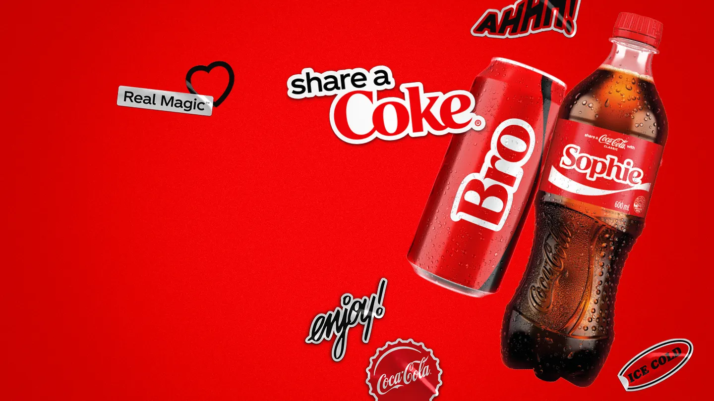
Departing from the norm should always have a reason. Coca-Cola’s “Share a Coke” replaced its iconic logo with people’s names — a dramatic break from one of the world’s most recognisable marks. The change didn’t dilute the brand; it deepened emotional connection. This balance between stability and adaptation is what keeps an identity alive and working for the long term.
Designing for Context
Designing for Context
When identity aligns with audience, timing, and environment, it becomes more than design — it becomes brand experience.
A strong visual identity is never static — it responds to where, when, and how it’s encountered. What works for a minimalist corporate site may fall flat in a high-energy festival setting. Similarly, the visual language that resonates in one region may need a cultural shift elsewhere. Successful branding considers the full context: audience mindset, location, medium, and moment.
Airbnb’s global campaigns adapt imagery, tone, and colour emphasis to local culture without losing the “Belong Anywhere” spirit. In the same way, Nike’s Women’s campaigns in Asia lean into bold, empowering visuals, while in Europe, they tap into streetwear culture with gritty textures and muted tones. In both cases, the brand DNA remains intact, yet the execution feels relevant to its setting.
This kind of context-aware design is not about constant reinvention; it’s about understanding what must remain fixed and what can flex. A core typeface might stay the same while photography style shifts; a signature colour can be paired with local accents; a logo can subtly adapt for different mediums. Designing for varied scenarios — from quick-glance billboards to in-depth retail displays — ensures the brand stays recognisable while meeting people where they are.


Structure as a Creative Tool
Structure as a Creative Tool
The strongest identities don’t fight structure — they use it as the launchpad for originality.
Even the boldest identities rest on a foundation: grid systems, composition, typography, and colour. These elements aren’t constraints; they’re what hold everything together when creativity pushes the boundaries. Spotify’s annual Wrapped campaign bursts with colour and motion, but the structure — type hierarchy, alignment, and layout — makes it unmistakably Spotify.
An effective identity system ensures that elements appear where audiences expect them, important content stands out, balance is maintained through an invisible grid, and visual monotony is avoided through contrast in scale, colour, and spacing. It also allows for content variations without breaking the design. This structure doesn’t limit experimentation; it makes it safer, guiding designers to innovate without losing coherence.
When the fundamentals are in place, creativity can thrive. Testing ideas with real people reveals how far you can push before clarity suffers. Mark what must remain untouchable — like readability or core colours — and define where you can experiment with patterns, proportions, or motion. As in music, you can only break rhythm effectively once you’ve mastered it. This blend of discipline and playfulness is what makes a visual identity not just functional, but truly unforgettable.


FAQ
FAQ
01
How does the process work?
02
How much does it cost?
03
How will we communicate?
04
Will I receive all the files and rights?
05
Can the project be completed urgently?
06
Do you work internationally?
07
What if I’m not satisfied with the result?
08
Do you provide support after the project is finished?
Aug 7, 2025
Visual Identity That Works
Polestar EV explores the future of electric mobility, blending cutting-edge design with innovation. Dive into the performance insights shaping the next area.
Branding
Graphic Design
Visual Identity
Brand Foundations in Action
Strong visual identity is built on clear principles — but the magic happens when you know how and when to adapt them.
A cohesive brand identity begins with consistency. Unified colour palettes, typographic hierarchies, and layout systems make a brand instantly recognisable across websites, packaging, social media, and print. This consistency streamlines creative workflows, ensuring every execution supports the same message and saving valuable time when multiple designers or agencies are involved.
Yet, when guidelines are followed too rigidly, the brand can become predictable and uninspiring. Every campaign risks looking like the last, gradually losing the spark that draws people in. The strongest brands reserve space for flexibility — opportunities to surprise and evolve while staying true to their core. Apple’s seasonal campaigns, for example, are rooted in minimalism and precision, but they occasionally introduce bold colour gradients, unexpected typography, or playful animations to refresh their familiar aesthetic.
Departing from the norm should always have a reason. Coca-Cola’s “Share a Coke” replaced its iconic logo with people’s names — a dramatic break from one of the world’s most recognisable marks. The change didn’t dilute the brand; it deepened emotional connection. This balance between stability and adaptation is what keeps an identity alive and working for the long term.
Designing for Context
When identity aligns with audience, timing, and environment, it becomes more than design — it becomes brand experience.
A strong visual identity is never static — it responds to where, when, and how it’s encountered. What works for a minimalist corporate site may fall flat in a high-energy festival setting. Similarly, the visual language that resonates in one region may need a cultural shift elsewhere. Successful branding considers the full context: audience mindset, location, medium, and moment.
Airbnb’s global campaigns adapt imagery, tone, and colour emphasis to local culture without losing the “Belong Anywhere” spirit. In the same way, Nike’s Women’s campaigns in Asia lean into bold, empowering visuals, while in Europe, they tap into streetwear culture with gritty textures and muted tones. In both cases, the brand DNA remains intact, yet the execution feels relevant to its setting.
This kind of context-aware design is not about constant reinvention; it’s about understanding what must remain fixed and what can flex. A core typeface might stay the same while photography style shifts; a signature colour can be paired with local accents; a logo can subtly adapt for different mediums. Designing for varied scenarios — from quick-glance billboards to in-depth retail displays — ensures the brand stays recognisable while meeting people where they are.
Structure as a Creative Tool
The strongest identities don’t fight structure — they use it as the launchpad for originality.
Even the boldest identities rest on a foundation: grid systems, composition, typography, and colour. These elements aren’t constraints; they’re what hold everything together when creativity pushes the boundaries. Spotify’s annual Wrapped campaign bursts with colour and motion, but the structure — type hierarchy, alignment, and layout — makes it unmistakably Spotify.
An effective identity system ensures that elements appear where audiences expect them, important content stands out, balance is maintained through an invisible grid, and visual monotony is avoided through contrast in scale, colour, and spacing. It also allows for content variations without breaking the design. This structure doesn’t limit experimentation; it makes it safer, guiding designers to innovate without losing coherence.
When the fundamentals are in place, creativity can thrive. Testing ideas with real people reveals how far you can push before clarity suffers. Mark what must remain untouchable — like readability or core colours — and define where you can experiment with patterns, proportions, or motion. As in music, you can only break rhythm effectively once you’ve mastered it. This blend of discipline and playfulness is what makes a visual identity not just functional, but truly unforgettable.
FAQ
01
How does the process work?
02
How much does it cost?
03
How will we communicate?
04
Will I receive all the files and rights?
05
Can the project be completed urgently?
06
Do you work internationally?
07
What if I’m not satisfied with the result?
08
Do you provide support after the project is finished?
Aug 7, 2025
Visual Identity That Works
Polestar EV explores the future of electric mobility, blending cutting-edge design with innovation. Dive into the performance insights shaping the next area.
Branding
Graphic Design
Visual Identity
Brand Foundations in Action
Strong visual identity is built on clear principles — but the magic happens when you know how and when to adapt them.
A cohesive brand identity begins with consistency. Unified colour palettes, typographic hierarchies, and layout systems make a brand instantly recognisable across websites, packaging, social media, and print. This consistency streamlines creative workflows, ensuring every execution supports the same message and saving valuable time when multiple designers or agencies are involved.
Yet, when guidelines are followed too rigidly, the brand can become predictable and uninspiring. Every campaign risks looking like the last, gradually losing the spark that draws people in. The strongest brands reserve space for flexibility — opportunities to surprise and evolve while staying true to their core. Apple’s seasonal campaigns, for example, are rooted in minimalism and precision, but they occasionally introduce bold colour gradients, unexpected typography, or playful animations to refresh their familiar aesthetic.
Departing from the norm should always have a reason. Coca-Cola’s “Share a Coke” replaced its iconic logo with people’s names — a dramatic break from one of the world’s most recognisable marks. The change didn’t dilute the brand; it deepened emotional connection. This balance between stability and adaptation is what keeps an identity alive and working for the long term.
Designing for Context
When identity aligns with audience, timing, and environment, it becomes more than design — it becomes brand experience.
A strong visual identity is never static — it responds to where, when, and how it’s encountered. What works for a minimalist corporate site may fall flat in a high-energy festival setting. Similarly, the visual language that resonates in one region may need a cultural shift elsewhere. Successful branding considers the full context: audience mindset, location, medium, and moment.
Airbnb’s global campaigns adapt imagery, tone, and colour emphasis to local culture without losing the “Belong Anywhere” spirit. In the same way, Nike’s Women’s campaigns in Asia lean into bold, empowering visuals, while in Europe, they tap into streetwear culture with gritty textures and muted tones. In both cases, the brand DNA remains intact, yet the execution feels relevant to its setting.
This kind of context-aware design is not about constant reinvention; it’s about understanding what must remain fixed and what can flex. A core typeface might stay the same while photography style shifts; a signature colour can be paired with local accents; a logo can subtly adapt for different mediums. Designing for varied scenarios — from quick-glance billboards to in-depth retail displays — ensures the brand stays recognisable while meeting people where they are.
Structure as a Creative Tool
The strongest identities don’t fight structure — they use it as the launchpad for originality.
Even the boldest identities rest on a foundation: grid systems, composition, typography, and colour. These elements aren’t constraints; they’re what hold everything together when creativity pushes the boundaries. Spotify’s annual Wrapped campaign bursts with colour and motion, but the structure — type hierarchy, alignment, and layout — makes it unmistakably Spotify.
An effective identity system ensures that elements appear where audiences expect them, important content stands out, balance is maintained through an invisible grid, and visual monotony is avoided through contrast in scale, colour, and spacing. It also allows for content variations without breaking the design. This structure doesn’t limit experimentation; it makes it safer, guiding designers to innovate without losing coherence.
When the fundamentals are in place, creativity can thrive. Testing ideas with real people reveals how far you can push before clarity suffers. Mark what must remain untouchable — like readability or core colours — and define where you can experiment with patterns, proportions, or motion. As in music, you can only break rhythm effectively once you’ve mastered it. This blend of discipline and playfulness is what makes a visual identity not just functional, but truly unforgettable.
FAQ
How does the process work?
How much does it cost?
How will we communicate?
Will I receive all the files and rights?
Can the project be completed urgently?
Do you work internationally?
What if I’m not satisfied with the result?
Do you provide support after the project is finished?