Aug 8, 2025
Designing Powerful Brands
How strategic design builds brands that connect, why storytelling matters as much as visuals, and what the world’s strongest identities have in common.
Branding
Design
Strategy
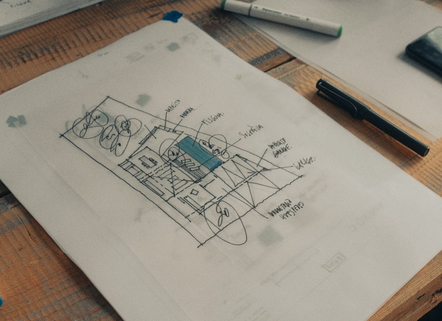
Branding Beyond the Logo
A powerful brand is more than a logo — it’s a complete visual and emotional system.
Many brands start with a logo, but the most impactful ones go far beyond that. A logo is just a signpost; what makes a brand powerful is the ecosystem around it: the colour palette, typography, iconography, photography style, motion language, and tone of voice — all working together to create an instantly recognisable presence.
Think of Nike. The swoosh is iconic, but it’s the combination of bold typography, high-contrast photography, empowering taglines, and consistent tone that creates the emotional punch. The same applies to brands like Chanel, where minimal monochrome palettes, serif typography, and timeless photography reinforce luxury and heritage in every touchpoint. Even startups understand the value of full systems early on. Notion, the productivity app, combines its simple black-and-white block “N” logo with clean illustrations, restrained typography, and a warm, human tone of copywriting. The result: a minimal yet instantly recognisable identity that works equally well on a landing page, in an app interface, or in an investor presentation.
The takeaway is simple: in modern branding, the logo is the start, not the finish line. Powerful brands invest in a complete design language that can live and breathe across platforms, media, and cultures.
Storytelling That Scales
Storytelling That Scales
The strongest brands pair visual identity with a narrative that audiences can believe in — and retell.
Design without story is decoration. A brand’s visuals might capture attention once, but it’s the narrative that keeps people engaged and turns customers into advocates. This story needs to be authentic, adaptable, and scalable across different contexts — from social media posts to product packaging to immersive experiences.
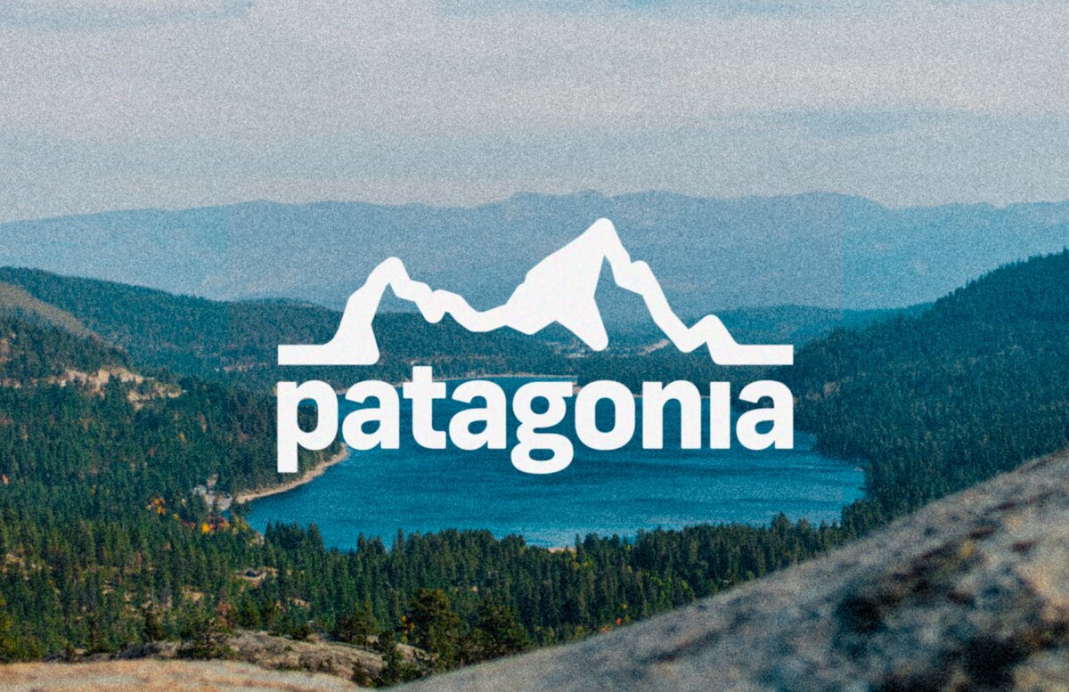
Airbnb is a prime example. Its “Belong Anywhere” positioning isn’t just a slogan; it’s expressed visually through warm photography of real hosts and guests, a colour palette that feels inviting, and a logo inspired by the universal symbols of people, location, and love. No matter the campaign — from global brand ads to local host events — the same narrative thread runs through. Similarly, Patagonia’s environmental mission drives its visual and verbal identity. The bold, blocky wordmark remains constant, while photography focuses on rugged landscapes and real adventurers. Their campaigns, whether in print or on Instagram, feel consistent because they always serve the same higher purpose: protecting the planet.
Even entertainment brands understand scalable storytelling. The Marvel Cinematic Universe uses a consistent typography style and red-black colour scheme, but what truly cements its power is the narrative continuity across dozens of films, TV shows, and marketing materials. Fans instantly recognise the visual cues because they’re tied to a shared storyline they care about. When visual identity and storytelling work together, brands don’t just stand out — they stick.

Powerful brands use systems not to limit creativity, but to amplify it.
Powerful brands use systems not to limit creativity, but to amplify it.
The Global Nikon Meetup ensures that every attendee walks away with an enriched photography experience that will shape their creative journey for years to come.®
A structured brand system doesn’t kill originality — it multiplies it. By establishing clear rules for typography, color use, photography style, iconography, and motion, a brand creates a foundation where every creative decision builds on the last, rather than starting from scratch.
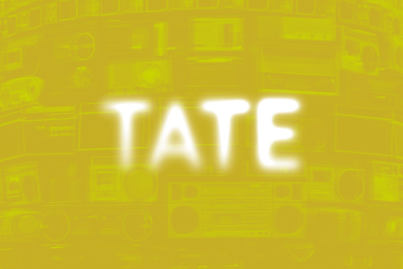
Apple is a clear example: the grid, type hierarchy, and disciplined use of white space provide the structure that allows bold photography and dramatic product reveals to shine. Whether in a keynote presentation, a subway ad in Tokyo, or the Apple Store website, the same system ensures a coherent experience. Coca-Cola achieves a similar effect with its “One Brand” strategy. The Spencerian script logo, red-and-white colour scheme, and distinctive ribbon graphic create instant recognition, but within that system, the company experiments widely — from minimalist print ads to kinetic outdoor installations and interactive vending machines. Even cultural institutions embrace this approach. The Tate galleries in the UK use a flexible typographic logo system that can adapt in texture, colour, and scale while keeping the core mark intact. This lets them create fresh visuals for exhibitions and events without losing their brand’s anchor.
The best systems are living, evolving tools. They document what works, adapt to new media, and keep a brand ready for the next platform or cultural shift. In this way, structure becomes the invisible engine that powers creative exploration — and ensures every experiment still feels like “you.”


FAQ
FAQ
01
How does the process work?
02
How much does it cost?
03
How will we communicate?
04
Will I receive all the files and rights?
05
Can the project be completed urgently?
06
Do you work internationally?
07
What if I’m not satisfied with the result?
08
Do you provide support after the project is finished?
Aug 8, 2025
Designing Powerful Brands
How strategic design builds brands that connect, why storytelling matters as much as visuals, and what the world’s strongest identities have in common.
Branding
Design
Strategy
Branding Beyond the Logo
A powerful brand is more than a logo — it’s a complete visual and emotional system.
Many brands start with a logo, but the most impactful ones go far beyond that. A logo is just a signpost; what makes a brand powerful is the ecosystem around it: the colour palette, typography, iconography, photography style, motion language, and tone of voice — all working together to create an instantly recognisable presence.
Think of Nike. The swoosh is iconic, but it’s the combination of bold typography, high-contrast photography, empowering taglines, and consistent tone that creates the emotional punch. The same applies to brands like Chanel, where minimal monochrome palettes, serif typography, and timeless photography reinforce luxury and heritage in every touchpoint. Even startups understand the value of full systems early on. Notion, the productivity app, combines its simple black-and-white block “N” logo with clean illustrations, restrained typography, and a warm, human tone of copywriting. The result: a minimal yet instantly recognisable identity that works equally well on a landing page, in an app interface, or in an investor presentation.
The takeaway is simple: in modern branding, the logo is the start, not the finish line. Powerful brands invest in a complete design language that can live and breathe across platforms, media, and cultures.
Storytelling That Scales
The strongest brands pair visual identity with a narrative that audiences can believe in — and retell.
Design without story is decoration. A brand’s visuals might capture attention once, but it’s the narrative that keeps people engaged and turns customers into advocates. This story needs to be authentic, adaptable, and scalable across different contexts — from social media posts to product packaging to immersive experiences.
Airbnb is a prime example. Its “Belong Anywhere” positioning isn’t just a slogan; it’s expressed visually through warm photography of real hosts and guests, a colour palette that feels inviting, and a logo inspired by the universal symbols of people, location, and love. No matter the campaign — from global brand ads to local host events — the same narrative thread runs through. Similarly, Patagonia’s environmental mission drives its visual and verbal identity. The bold, blocky wordmark remains constant, while photography focuses on rugged landscapes and real adventurers. Their campaigns, whether in print or on Instagram, feel consistent because they always serve the same higher purpose: protecting the planet.
Even entertainment brands understand scalable storytelling. The Marvel Cinematic Universe uses a consistent typography style and red-black colour scheme, but what truly cements its power is the narrative continuity across dozens of films, TV shows, and marketing materials. Fans instantly recognise the visual cues because they’re tied to a shared storyline they care about. When visual identity and storytelling work together, brands don’t just stand out — they stick.
Powerful brands use systems not to limit creativity, but to amplify it.
The Global Nikon Meetup ensures that every attendee walks away with an enriched photography experience that will shape their creative journey for years to come.®
A structured brand system doesn’t kill originality — it multiplies it. By establishing clear rules for typography, color use, photography style, iconography, and motion, a brand creates a foundation where every creative decision builds on the last, rather than starting from scratch.
Apple is a clear example: the grid, type hierarchy, and disciplined use of white space provide the structure that allows bold photography and dramatic product reveals to shine. Whether in a keynote presentation, a subway ad in Tokyo, or the Apple Store website, the same system ensures a coherent experience. Coca-Cola achieves a similar effect with its “One Brand” strategy. The Spencerian script logo, red-and-white colour scheme, and distinctive ribbon graphic create instant recognition, but within that system, the company experiments widely — from minimalist print ads to kinetic outdoor installations and interactive vending machines. Even cultural institutions embrace this approach. The Tate galleries in the UK use a flexible typographic logo system that can adapt in texture, colour, and scale while keeping the core mark intact. This lets them create fresh visuals for exhibitions and events without losing their brand’s anchor.
The best systems are living, evolving tools. They document what works, adapt to new media, and keep a brand ready for the next platform or cultural shift. In this way, structure becomes the invisible engine that powers creative exploration — and ensures every experiment still feels like “you.”
FAQ
01
How does the process work?
02
How much does it cost?
03
How will we communicate?
04
Will I receive all the files and rights?
05
Can the project be completed urgently?
06
Do you work internationally?
07
What if I’m not satisfied with the result?
08
Do you provide support after the project is finished?
Aug 8, 2025
Designing Powerful Brands
How strategic design builds brands that connect, why storytelling matters as much as visuals, and what the world’s strongest identities have in common.
Branding
Design
Strategy
Branding Beyond the Logo
A powerful brand is more than a logo — it’s a complete visual and emotional system.
Many brands start with a logo, but the most impactful ones go far beyond that. A logo is just a signpost; what makes a brand powerful is the ecosystem around it: the colour palette, typography, iconography, photography style, motion language, and tone of voice — all working together to create an instantly recognisable presence.
Think of Nike. The swoosh is iconic, but it’s the combination of bold typography, high-contrast photography, empowering taglines, and consistent tone that creates the emotional punch. The same applies to brands like Chanel, where minimal monochrome palettes, serif typography, and timeless photography reinforce luxury and heritage in every touchpoint. Even startups understand the value of full systems early on. Notion, the productivity app, combines its simple black-and-white block “N” logo with clean illustrations, restrained typography, and a warm, human tone of copywriting. The result: a minimal yet instantly recognisable identity that works equally well on a landing page, in an app interface, or in an investor presentation.
The takeaway is simple: in modern branding, the logo is the start, not the finish line. Powerful brands invest in a complete design language that can live and breathe across platforms, media, and cultures.
Storytelling That Scales
The strongest brands pair visual identity with a narrative that audiences can believe in — and retell.
Design without story is decoration. A brand’s visuals might capture attention once, but it’s the narrative that keeps people engaged and turns customers into advocates. This story needs to be authentic, adaptable, and scalable across different contexts — from social media posts to product packaging to immersive experiences.
Airbnb is a prime example. Its “Belong Anywhere” positioning isn’t just a slogan; it’s expressed visually through warm photography of real hosts and guests, a colour palette that feels inviting, and a logo inspired by the universal symbols of people, location, and love. No matter the campaign — from global brand ads to local host events — the same narrative thread runs through. Similarly, Patagonia’s environmental mission drives its visual and verbal identity. The bold, blocky wordmark remains constant, while photography focuses on rugged landscapes and real adventurers. Their campaigns, whether in print or on Instagram, feel consistent because they always serve the same higher purpose: protecting the planet.
Even entertainment brands understand scalable storytelling. The Marvel Cinematic Universe uses a consistent typography style and red-black colour scheme, but what truly cements its power is the narrative continuity across dozens of films, TV shows, and marketing materials. Fans instantly recognise the visual cues because they’re tied to a shared storyline they care about. When visual identity and storytelling work together, brands don’t just stand out — they stick.
Powerful brands use systems not to limit creativity, but to amplify it.
The Global Nikon Meetup ensures that every attendee walks away with an enriched photography experience that will shape their creative journey for years to come.®
A structured brand system doesn’t kill originality — it multiplies it. By establishing clear rules for typography, color use, photography style, iconography, and motion, a brand creates a foundation where every creative decision builds on the last, rather than starting from scratch.
Apple is a clear example: the grid, type hierarchy, and disciplined use of white space provide the structure that allows bold photography and dramatic product reveals to shine. Whether in a keynote presentation, a subway ad in Tokyo, or the Apple Store website, the same system ensures a coherent experience. Coca-Cola achieves a similar effect with its “One Brand” strategy. The Spencerian script logo, red-and-white colour scheme, and distinctive ribbon graphic create instant recognition, but within that system, the company experiments widely — from minimalist print ads to kinetic outdoor installations and interactive vending machines. Even cultural institutions embrace this approach. The Tate galleries in the UK use a flexible typographic logo system that can adapt in texture, colour, and scale while keeping the core mark intact. This lets them create fresh visuals for exhibitions and events without losing their brand’s anchor.
The best systems are living, evolving tools. They document what works, adapt to new media, and keep a brand ready for the next platform or cultural shift. In this way, structure becomes the invisible engine that powers creative exploration — and ensures every experiment still feels like “you.”
FAQ
How does the process work?
How much does it cost?
How will we communicate?
Will I receive all the files and rights?
Can the project be completed urgently?
Do you work internationally?
What if I’m not satisfied with the result?
Do you provide support after the project is finished?