
2024
Influencer Marketing Agency Branding
A bold, AI-powered identity built for a global influencer marketing agency. Balancing sharp precision with creative energy, this rebrand translates data-driven performance into a scalable, dynamic visual language.
Brand Identity
Web Design
Marketing Strategy
Overview
From data precision to creative power — this rebrand captures the speed, ambition, and global reach of an AI-driven influencer marketing agency.
Bold Identity for a Global Stage
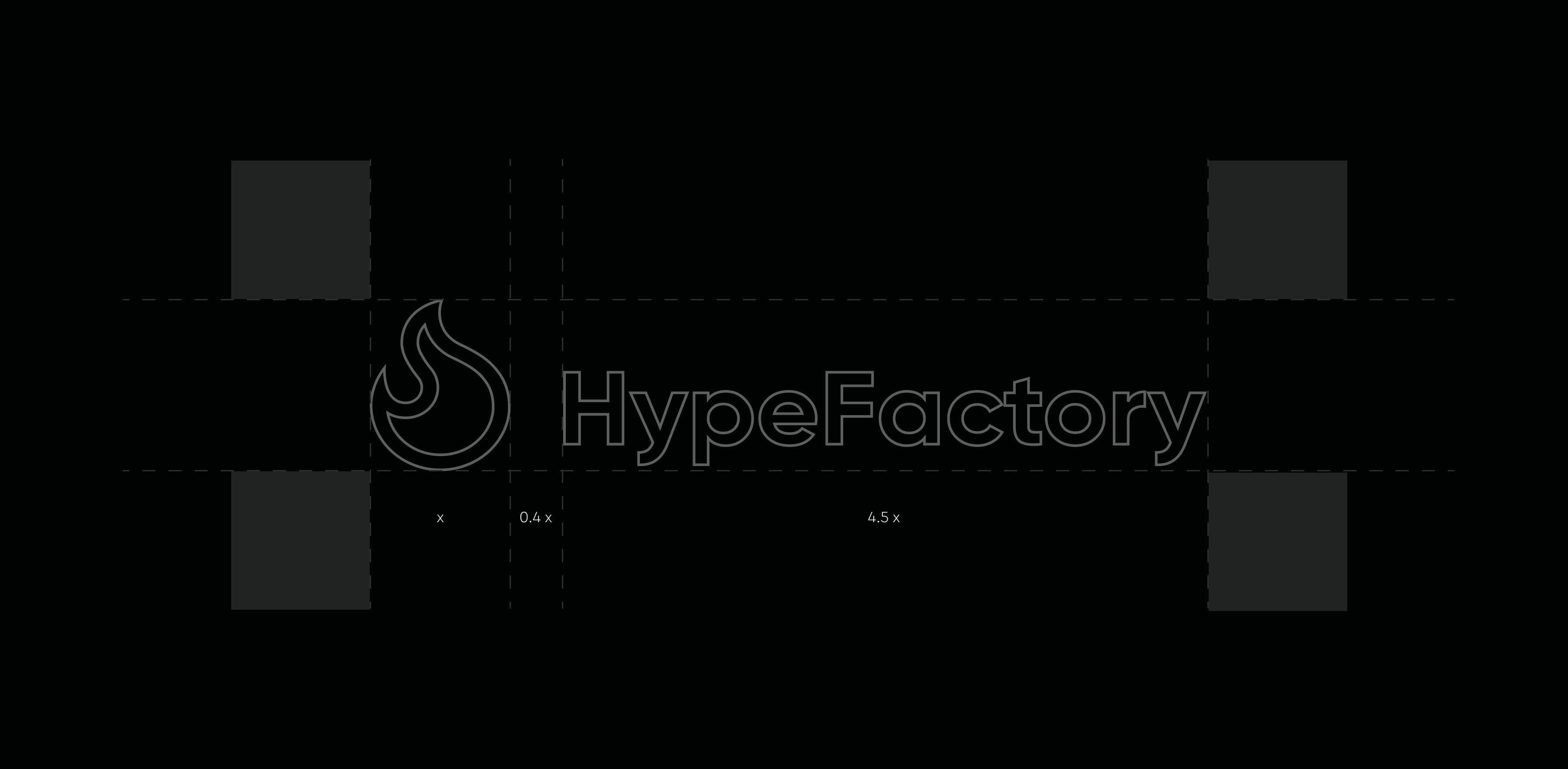
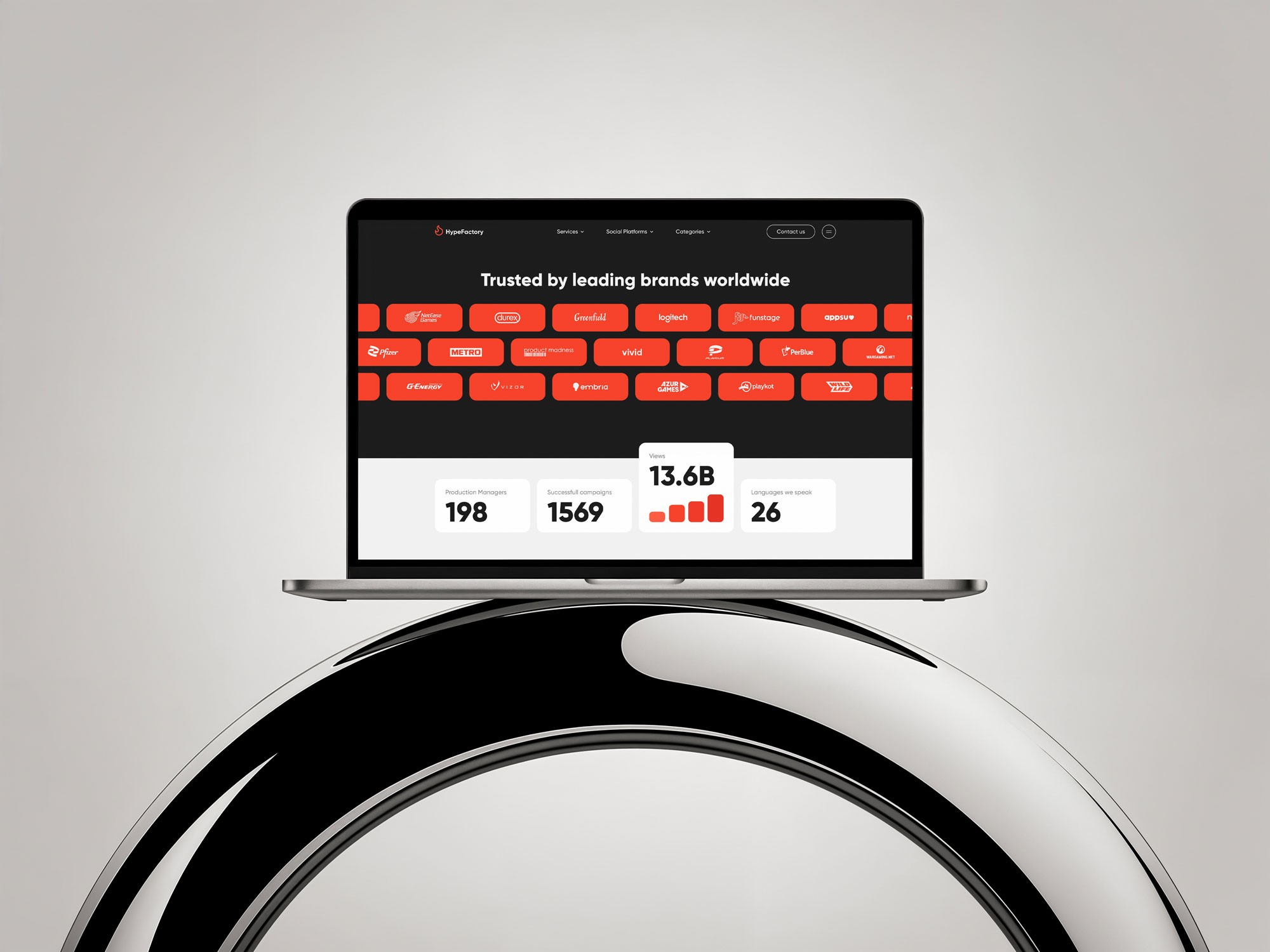
HypeFactory’s campaigns run across 30+ countries, connecting gaming giants, fintech innovators, and lifestyle brands with audiences worldwide. As the company’s pace accelerated, its identity needed to evolve — moving from a restrained, static look to a dynamic system that could adapt across digital, print, and motion. The result is a scalable visual language that strikes a balance between credibility and creative energy, delivering clarity, rhythm, and a modern presence at every touchpoint.
Challenge
Outgrown by its own success: reimagining an identity that could no longer match the speed, scale, and creative ambition of a global AI-powered influencer marketing leader.
HypeFactory operates at the forefront of influencer marketing, running high-impact campaigns in more than 30 countries for clients ranging from gaming giants to fintech innovators. However, as the company’s reputation and reach expanded, its original visual language began to hinder its growth. What once felt appropriate now seemed too restrained, too narrow, and too quiet for a brand that thrives on bold ideas and rapid execution. The challenge was not just to update the look — it was to design a system capable of adapting to diverse formats, from social media assets to large-scale events, without losing cohesion. The new identity needed to be as fast-moving and ambitious as the team behind it, while remaining instantly recognisable in any context.
Solution
Creating a future-ready design system that balances precision with expressive energy, giving the brand a clear, unified voice adaptable to every channel, region, and audience it serves.
The rebrand centred on building a flexible yet robust identity framework that could keep pace with HypeFactory’s rapid growth. Every element was designed with scalability in mind — from streamlined typography to adaptable layouts — ensuring the system could work seamlessly across digital, print, and motion environments. Overly complex or rigid visual cues were stripped away in favour of confident simplicity, allowing the brand to communicate with authority while retaining a distinctive creative spark. The result is a design language that can speak to data-driven professionals and emotionally engaged audiences alike, making the brand both versatile and unmistakable.

Creative Direction
Establishing a visual rhythm that unites a fast-moving global team under one adaptable voice, amplifying the brand’s presence with modern confidence, clarity, and a sense of unstoppable momentum.
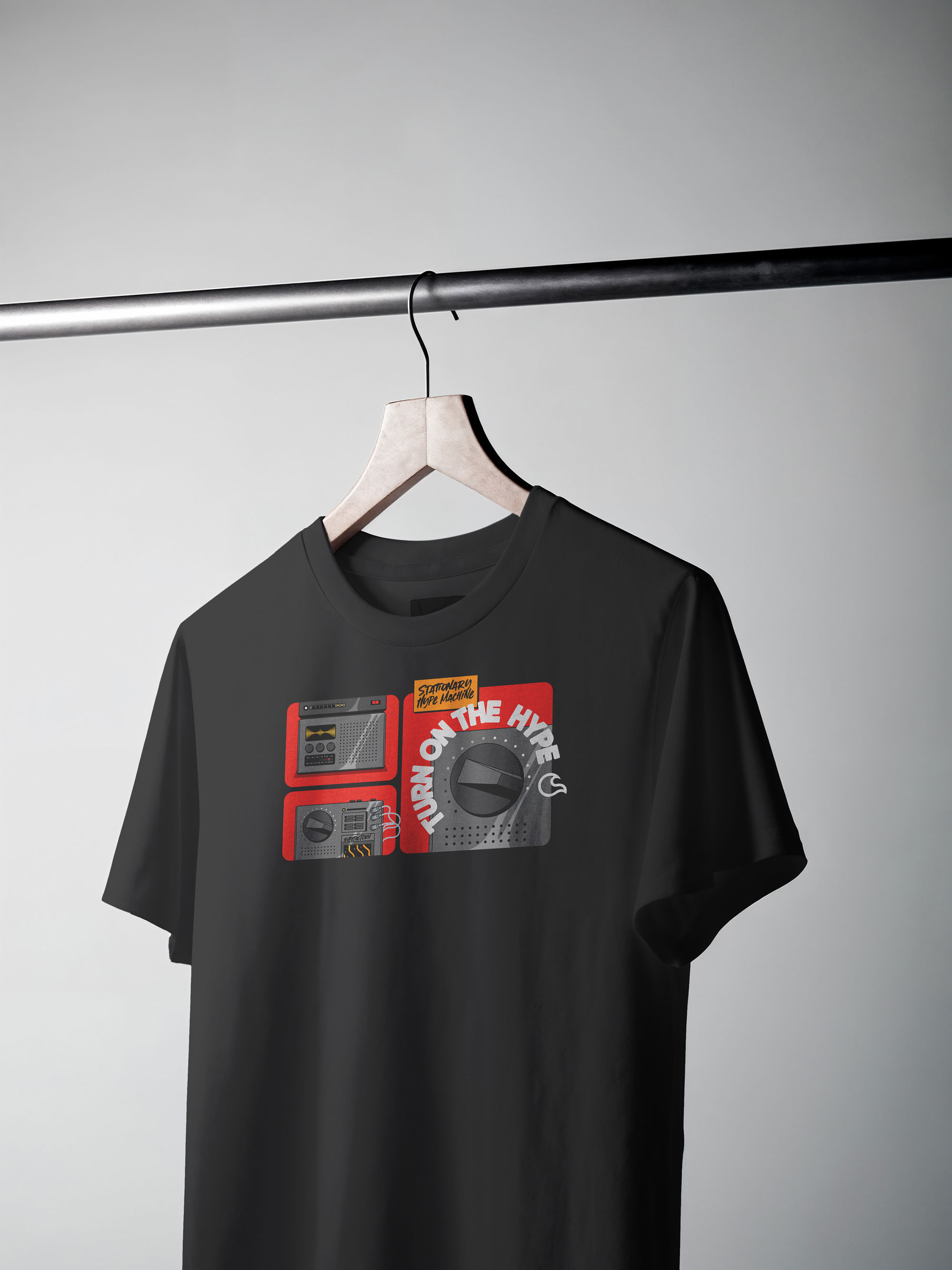
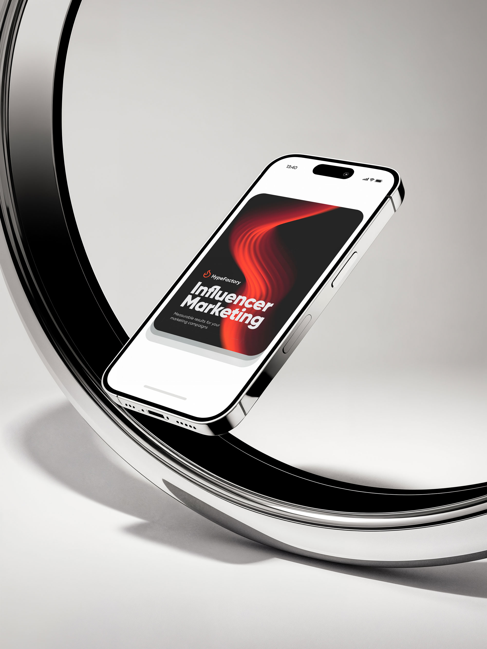
The creative direction focused on finding the balance between clarity and character, ensuring the identity could adapt without losing its core personality. A sense of rhythm runs through every element — from bold, precise typography to fluid motion principles — giving the brand both structure and flexibility. The design avoids unnecessary ornamentation in favour of purposeful details that leave a strong impression, whether in a data dashboard, a live event, or a global ad campaign. With this foundation in place, HypeFactory can move faster, align more easily across teams and regions, and deliver a consistent, high-impact presence everywhere it appears.
More Works
©2025
FAQ
01
How does the process work?
02
How much does it cost?
03
How will we communicate?
04
Will I receive all the files and rights?
05
Can the project be completed urgently?
06
Do you work internationally?
07
What if I’m not satisfied with the result?
08
Do you provide support after the project is finished?
2024
Influencer Marketing Agency Branding
A bold, AI-powered identity built for a global influencer marketing agency. Balancing sharp precision with creative energy, this rebrand translates data-driven performance into a scalable, dynamic visual language.
Brand Identity
Web Design
Marketing Strategy
Overview
From data precision to creative power — this rebrand captures the speed, ambition, and global reach of an AI-driven influencer marketing agency.
Bold Identity for a Global Stage
HypeFactory’s campaigns run across 30+ countries, connecting gaming giants, fintech innovators, and lifestyle brands with audiences worldwide. As the company’s pace accelerated, its identity needed to evolve — moving from a restrained, static look to a dynamic system that could adapt across digital, print, and motion. The result is a scalable visual language that strikes a balance between credibility and creative energy, delivering clarity, rhythm, and a modern presence at every touchpoint.
Challenge
Outgrown by its own success: reimagining an identity that could no longer match the speed, scale, and creative ambition of a global AI-powered influencer marketing leader.
HypeFactory operates at the forefront of influencer marketing, running high-impact campaigns in more than 30 countries for clients ranging from gaming giants to fintech innovators. However, as the company’s reputation and reach expanded, its original visual language began to hinder its growth. What once felt appropriate now seemed too restrained, too narrow, and too quiet for a brand that thrives on bold ideas and rapid execution. The challenge was not just to update the look — it was to design a system capable of adapting to diverse formats, from social media assets to large-scale events, without losing cohesion. The new identity needed to be as fast-moving and ambitious as the team behind it, while remaining instantly recognisable in any context.
Solution
Creating a future-ready design system that balances precision with expressive energy, giving the brand a clear, unified voice adaptable to every channel, region, and audience it serves.
The rebrand centred on building a flexible yet robust identity framework that could keep pace with HypeFactory’s rapid growth. Every element was designed with scalability in mind — from streamlined typography to adaptable layouts — ensuring the system could work seamlessly across digital, print, and motion environments. Overly complex or rigid visual cues were stripped away in favour of confident simplicity, allowing the brand to communicate with authority while retaining a distinctive creative spark. The result is a design language that can speak to data-driven professionals and emotionally engaged audiences alike, making the brand both versatile and unmistakable.
Creative Direction
Establishing a visual rhythm that unites a fast-moving global team under one adaptable voice, amplifying the brand’s presence with modern confidence, clarity, and a sense of unstoppable momentum.
The creative direction focused on finding the balance between clarity and character, ensuring the identity could adapt without losing its core personality. A sense of rhythm runs through every element — from bold, precise typography to fluid motion principles — giving the brand both structure and flexibility. The design avoids unnecessary ornamentation in favour of purposeful details that leave a strong impression, whether in a data dashboard, a live event, or a global ad campaign. With this foundation in place, HypeFactory can move faster, align more easily across teams and regions, and deliver a consistent, high-impact presence everywhere it appears.
More Works
©2025
FAQ
How does the process work?
How much does it cost?
How will we communicate?
Will I receive all the files and rights?
Can the project be completed urgently?
Do you work internationally?
What if I’m not satisfied with the result?
Do you provide support after the project is finished?